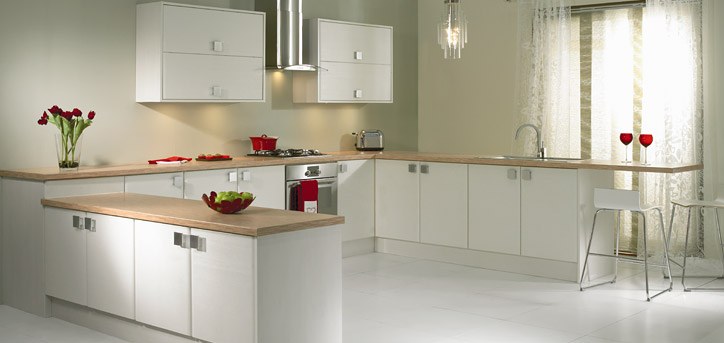
Popular Paint Colors for Your Kitchen
There are lots of ways that you could approach a kitchen renovation project. Of course, you can install new counter tops or cabinets or even just resurface them to save a little money (and time). And if you like the sound of saving money, you could always just change the paint on the walls to make the whole room feel like new, but on a budget. If that sounds like something you want to pursue, here are a few popular Divine Cabinetry kitchen colors (and why people like them).
RED
Red is considered one of the warm colors, of course. Some health experts say that warm colors have been found to stimulate the appetite, so that makes red a good color for any room where you might find yourself eating. Obviously, that includes the kitchen. And you don’t have to necessarily pick the bright Fire Engine or Cherry red, which might be a little too “hot” for the space. Instead, consider a darker, more subdued shade.
BLUE
On the other hand, cool colors like Blue can also make for a good kitchen color. Blue is crisp and fresh, inciting calm with a reminiscence of a cloudless sky or a mountain lake on a windless day. When used minimally, blue can also help to invigorate. And, much like red, blue has a wide range of shades that accent other colors well, too.
YELLOW
A long-time popular kitchen color, yellow is the color of spring; of sunshine and happiness; of blooming flowers. Yellow is inviting and invigorating, encouraging energized motivation but also a sense of calm, too. Another benefit of yellow, though—and one that you probably were not aware of—is that can actually make a room feel bigger than it is.
GRAY
For all intents and purposes, gray is the new white; at least, in terms of kitchen wall paint colors. White has ruled the kitchen remodeling world for many years but it looks like it’s time to move on has come. That’s not to say that nobody wants white anymore, but gray is quickly growing in popularity. Many homeowners are now saying that gray is more versatile as a base tone, offering more choices for secondary colors. Now, at first glance, you might mistake gray for a cold tone (like concrete, rain clouds, etc.) but when appropriately paired with brighter colors, gray actually becomes much brighter.


